Case Study: Motion Design
Data In Motion
Animated Medical User Interface Design
Project Overview
Role:
Timeline:
Delieverables:
Motion Designer, Dual-Licensed Nurse
4 weeks as Self-Initiated Portfolio Project
Animated UI prototype, design system, process documentation
Transforming 17 years of clinical experience into a motion design case study that bridges healthcare expertise with interface design
The Challenge
Picture this: It's 3 AM in the ICU. A patient's condition is deteriorating. The nurse is staring at a monitor showing 47 different data points across 6 different screens. Vital information is buried somewhere in that visual noise. Every second of searching could matter.
This isn't hypothetical—I lived it for 17 years across hospitals in Germany and Spain. Modern medical interfaces present mountains of data but fail at their core job: helping healthcare professionals make fast, confident decisions under pressure.
The Solution
Data In Motion bridges my 17 years of nursing experience with motion design to create an animated medical interface concept that transforms how vital patient information is presented. Instead of static displays, the interface uses purposeful animation to guide attention, establish information hierarchy, and reduce cognitive load.
The Process
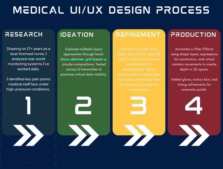
Analytical design methodology grounded in clinical experience. Four discrete phases—Research, Ideation, Refinement, Production—each phase built on insights from 17 years of nursing practice.
Phase 1: Research
I analyzed the medical monitoring systems I'd used during my 17+ years across various departments. Key pain points emerged from direct observation: healthcare professionals spending more time searching for information than using it, critical changes buried in visual noise, and cognitive overload during high-pressure moments.
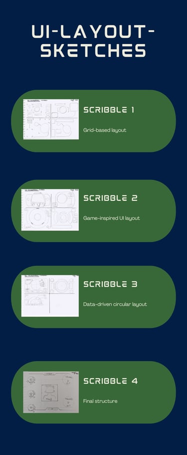
Phase 2: Ideation
I explored multiple layout approaches through hand-drawn sketches. Four iterations moved from traditional grid-based medical layouts (Scribble 1) toward circular compositions (Scribbles 2-4). Each sketch tested different hypotheses about organizing life-critical information under stress. The circular focal design won because it draws attention naturally to central data, supports radial hierarchy, and feels less overwhelming than grid density.
Phase 3: Refinement
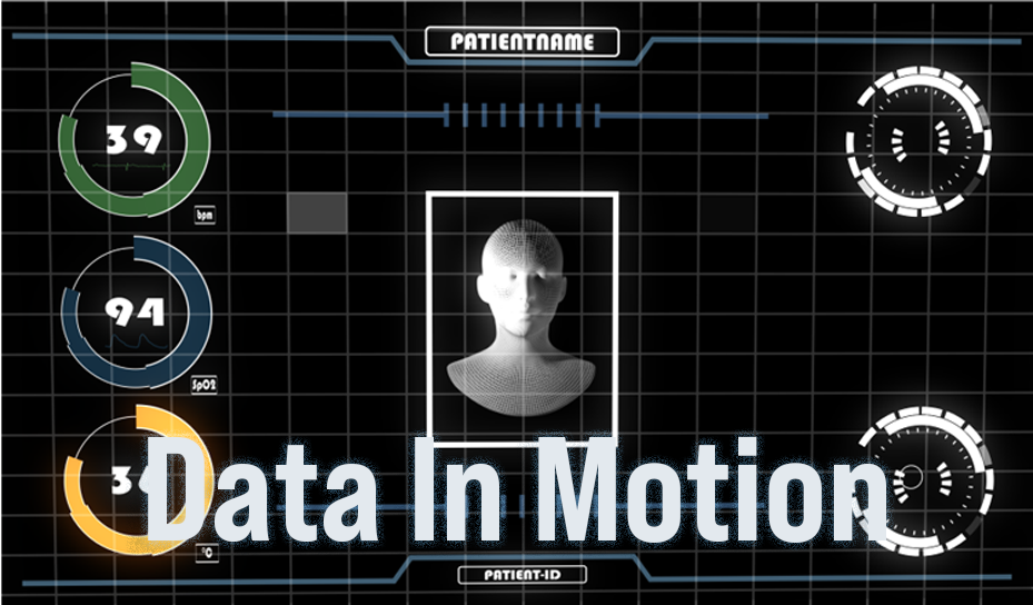
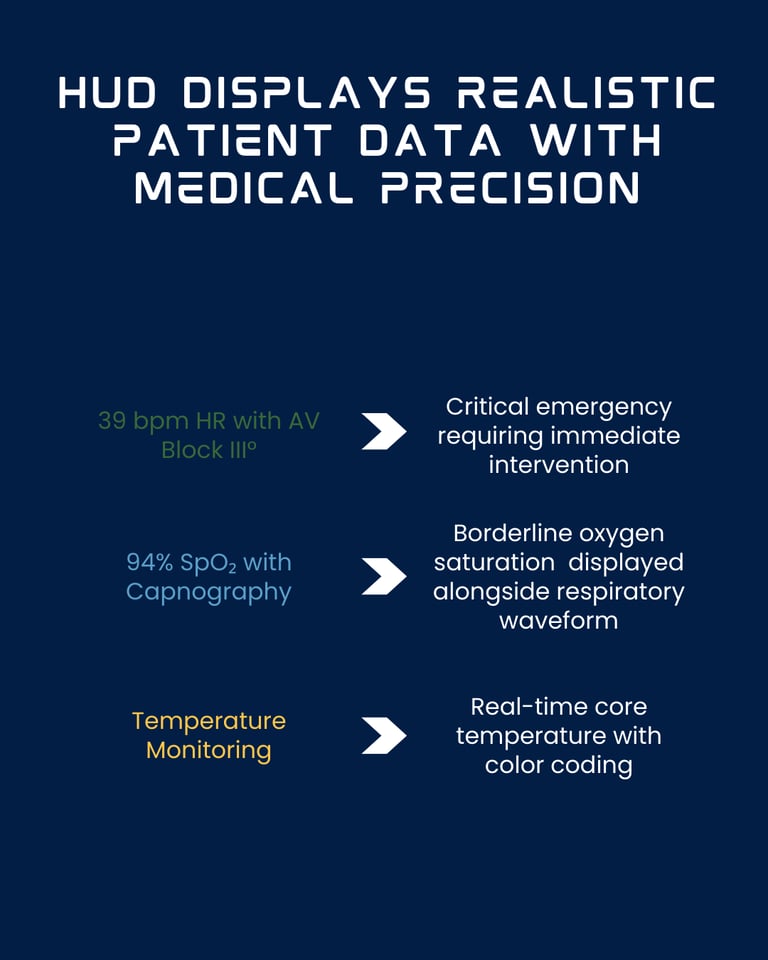
I populated the design with clinically accurate data: realistic heart rates (39 bpm), oxygen saturation (94% SpO₂), temperature readings (36°C), and real-time waveforms representing ECG and capnography patterns.
Applied medical standard color-coding: green for cardiac monitoring, blue for respiratory, orange for temperature. This phase proved the concept works with real clinical scenarios, not just placeholder data.
Phase 4: Production
Animated in After Effects using shape layers for scalable vector graphics, expression-based scripting for dynamic behavior, and virtual camera movements to create depth in 2D space. Each animation was timed for typical clinical decision-making speeds under pressure—fast enough to be efficient, slow enough to be comprehensible when stressed. Added subtle motion blur and glow effects for polish while maintaining clinical clarity.
Key Features
Grid-Based Foundation
The technical grid creates depth in 2D space while serving critical functions: spatial anchoring during animations, familiar medical aesthetic (ECG paper, monitoring screens), and consistent reference points that prevent disorientation. The grid appears immediately and remains persistent—maintaining visual stability while complex data animates over it.
Three-Circle Vital Signs System
The animation shows three stacked circles with distinct purposes:
This vertical stack represents the "vital signs trifecta" that clinicians check first. The stacking creates a quick-scan column where nurses can assess patient stability in under 2 seconds. Color coding follows medical monitor conventions while remaining colorblind-friendly.
Green (bpm)
Blue (SpO₂)
Orange (°C)
Heart rate
Oxygen saturation
Temperature
Cardiac monitoring standard
Respiratory system
Thermal monitoring
Central Wireframe Avatar
The rotating wireframe head stands as an exemplar for the patient. Due to data protection regulations, this avatar is used. It is meant to symbolize that the human being is always at the center.
Smooth, Calm Motion Language
Every transition uses smooth ease-in-out curves. Elements fade gradually, never jump. The patient avatar rotates at constant, calm speed. This creates "organic" motion that feels controlled-critical for healthcare professionals.
Minimal Text, Maximum Clarity
Medicine is based on clear, evidence‑based decisions. Therefore, it was necessary to reduce the text to the absolute minimum. This gives the visual elements greater significance and allows a medical diagnosis to be reached more quickly.
What I learned
I taught myself 2D animation fundamentals in After Effects while building Data In Motion.
My clinical nursing experience directly informed the design choices:
the three-circle vital signs system (HR, SpO₂, Temperature) mirrors the quick-scan triage every healthcare professional have to perform on a daily bases.
The smooth ease-in-out animations reflect the calm-under-pressure mindset needed in ICUs, ERs, ORs, or even on a ward.
The minimal text approach (only six labels across the entire interface) came from understanding that stressed clinicians pattern-recognize faster than they read.
The result is a clean, minimalist user interface where every animation decision—from the sequential 29-second build sequence to the restrained color palette (green for cardiac, blue for respiratory, orange for temperature)—serves a functional purpose rooted in real clinical workflows.